MDX with React + Vite + Tailwind CSS

React

MDX is an extension of Markdown that also works with React components. It is super powerful because you can write plain text for blog style content (no need to wrap everything in tags!) while also being able to define your own elements and even insert React code.

However, the popular bundler Vite does not support MDX out of the box. This is because MDX requires a custom loader to parse the content and convert it to JSX. In this post, I will show you how to set up MDX with React and Vite using the popular library @mdx-js/rollup. I will also show you how to parse frontmatter using additional libraries from remark.

Tailwind CSS offers a plugin called @tailwindcss/typography that can style markdown content nicely. I will set it up to work with MDX. Further, I will discuss how to overwrite Typography to provide your own styles such as custom syntax highlighting.

I've also created a GitHub repository that you can use as a template to get started with MDX, React, and Vite. Each branch corresponds to a step in this post. They build up incrementally so you can follow along. Click the links in the section title to go to a branch. It is essentially a simpler version of my blog (this one you are reading right now is an mdx file!) and I hope it helps you build yours too.

1. Setting up MDX

Install dependencies: npm install @mdx-js/react @mdx-js/rollup

Then add import mdx from "@mdx-js/rollup" to the top and mdx() to plugins section inside vite.config.js. It should look something like this:

import { defineConfig } from "vite";
import react from "@vitejs/plugin-react";
import mdx from "@mdx-js/rollup";

export default defineConfig({
plugins: [react(), mdx()],
});

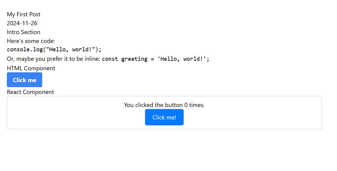
Here's an example of how you can import a MDX file and render it as a React component. To see a complete demo that imports all MDX files from a folder, check out my github demo step-01. If you need a refresher on MDX syntax, check out the official documentation or this pretty extensive guide on different MDX elements.

// src/components/BlogPost.jsx
import { useParams } from "react-router-dom";
import { useState, useEffect } from "react";

const BlogPost = () => {
const [PostContent, setPostContent] = useState(null);

useEffect(() => {
import(`./posts/my-first-post.mdx`)
.then((module) => {
setPostContent(() => module.default); // Store the content of the MDX file
})
.catch(() => setPostContent(() => () => <p>Post not found!</p>));
}, [slug]);

return (
<div className="prose max-w-4xl mx-auto p-6">
{PostContent ? <PostContent /> : <p>Loading...</p>}
</div>
);
};

export default BlogPost;

2. Parsing Frontmatter

Frontmatter can contain metadata that is not part of the main content. It is often used to store information like the title, date, tags, and image of a blog post. It can be parsed before compilation so you can also use it to generate a table of contents or other features.

To parse it, we need to first install dependencies: npm install remark-frontmatter remark-mdx-frontmatter

Add remarkFrontmatter and remarkMdxFrontmatter to the remarkPlugins section inside vite.config.js. It should look something like this:

import { defineConfig } from "vite";
import react from "@vitejs/plugin-react";
import mdx from "@mdx-js/rollup";
import remarkFrontmatter from "remark-frontmatter";
import remarkMdxFrontmatter from "remark-mdx-frontmatter";

export default defineConfig({
plugins: [
react(),
mdx({
remarkPlugins: [remarkFrontmatter, remarkMdxFrontmatter],
}),
],
});

Here's an example on how to access it inside the MDX file:

import { useParams } from "react-router-dom";
import { useState, useEffect } from "react";

const BlogPost = () => {
const { slug } = useParams(); // Extract slug from the URL
const [PostContent, setPostContent] = useState(null);
const [frontmatter, setFrontmatter] = useState(null);

useEffect(() => {
import(`./posts/${slug}.mdx`)
.then((module) => {
setPostContent(() => module.default); // Store the content of the MDX file
setFrontmatter(() => module.frontmatter); // Frontmatter content
})
.catch(() => setPostContent(() => () => <p>Post not found!</p>));
}, [slug]);

return (
<div>
{frontmatter && (
<header>
<h1>{frontmatter.title || "Untitled"}</h1>
<p>{frontmatter.date}</p>
{/* Add any additional frontmatter fields here, e.g., author, tags, etc. */}
</header>
)}

{PostContent ? <PostContent /> : <p>Loading...</p>}
</div>
);
};

export default BlogPost;

To use it before compilation (e.g. to generate a table of contents), you can follow the example below. BlogList is a component that lists all the blog posts in a folder. It dynamically imports the MDX files and extracts the metadata from the frontmatter. You can also extract more fields from the frontmatter if needed. Check out the demo here.

import { Link } from "react-router-dom";
import { useEffect, useState } from "react";

const BlogList = () => {
const [posts, setPosts] = useState([]);

useEffect(() => {
// Dynamically import MDX files and their metadata
const postModules = import.meta.glob("./posts/*.mdx", { eager: true });
const postList = Object.entries(postModules).map(([path, module]) => {
const slug = path.match(/([^/]+)\.mdx$/)[1]; // Extract the filename as slug
return {
slug,
title: module.frontmatter.title,
date: module.frontmatter.date,
description: module.frontmatter.description,
image: module.frontmatter.image,
tags: module.frontmatter.tags,
};
});
setPosts(postList);
}, []);

return (
<div>
<h1>Blog</h1>
<ul>
{posts.map((post) => (
<li key={post.slug}>
<Link to={`/${post.slug}`}>
<h2>{post.title}</h2>
</Link>
{post.image && <img src={post.image} alt={post.title} />}
<p>Published on {new Date(post.date).toLocaleDateString()}</p>
<p>{post.description}</p>
{post.tags && (
<div>
{post.tags.map((tag) => (
<span key={tag}>#{tag}</span>
))}
</div>
)}
</li>
))}
</ul>
</div>
);
};

export default BlogList;

3. Styling with Tailwind CSS Typography

Tailwind CSS offers a plugin called @tailwindcss/typography that can style markdown content nicely.

Here are the commands to install tailwind and typography:

npm install -D tailwindcss postcss autoprefixer
npx tailwindcss init -p
npm install @tailwindcss/typography

Then import typography in the tailwind.config.js file. It should look something like this:

/** @type {import('tailwindcss').Config} */

import typography from "@tailwindcss/typography";

export default {
content: [],
theme: {
extend: {},
},
plugins: [typography],
};

Then add these to index.css:

@tailwind base;
@tailwind components;
@tailwind utilities;

In order for the styles to be applied, you also need to add prose class to the container for elements compiled from MDX. For example, add prose to the div in the BlogPost component:

return (
<div className="prose max-w-4xl p-6">
{frontmatter && (
<header>
<h1>{frontmatter.title || "Untitled"}</h1>
<p>{frontmatter.date}</p>
{/* Add any additional frontmatter fields here, e.g., author, tags, etc. */}
</header>
)}

{PostContent ? <PostContent /> : <p>Loading...</p>}
</div>
);

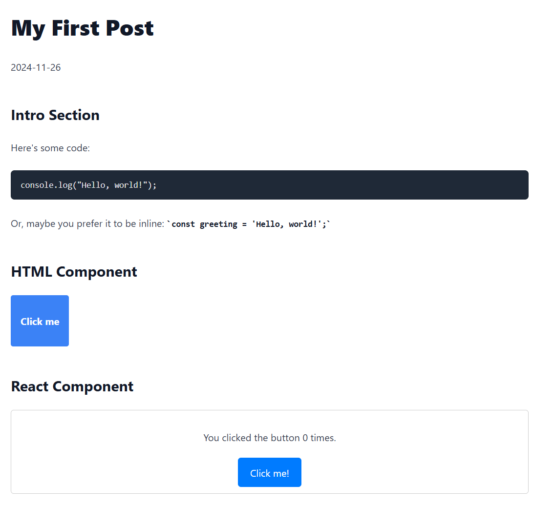
Now your content should be styled nicely with Tailwind CSS Typography! Here is a comparison of the same content with and without the typography plugin. The demo for this step can be found here.

Content without Tailwind CSS TypographyContent with Tailwind CSS Typography

4. Customizing Tailwind CSS Typography

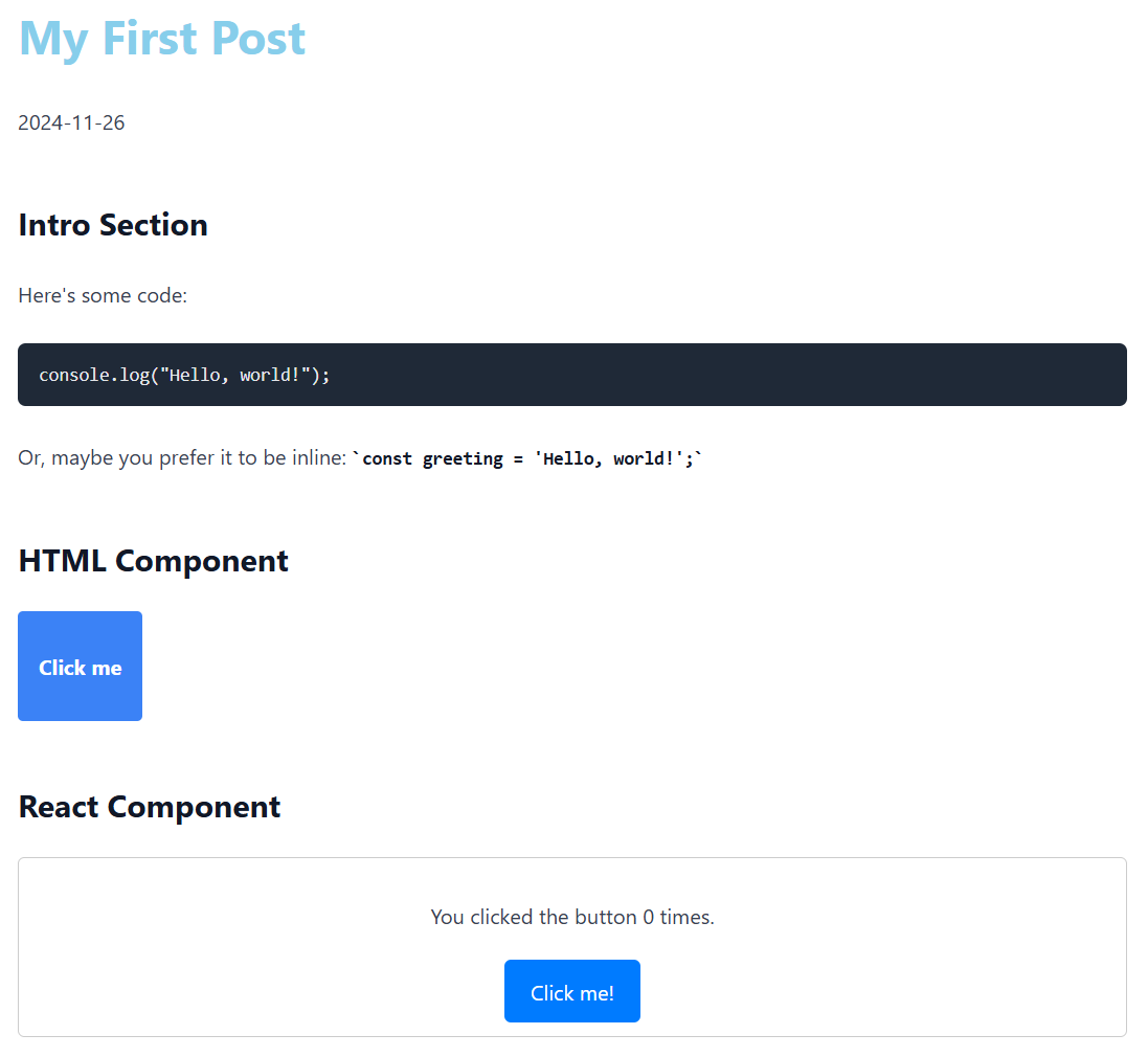
To customize the styles provided by Tailwind CSS Typography, you can overwrite the default styles in the tailwind.config.js file. For example, if you wanted to change the color of the h1 element to skyblue and make it have 600 font weight, you can do so like this:

import typography from "@tailwindcss/typography";

export default {
content: [
"./index.html",
"./src/**/*.{js,ts,jsx,tsx,mdx}",
"./posts/**/*.mdx",
],
theme: {
extend: {
typography: {
DEFAULT: {
css: {
h1: {
fontWeight: "600",
color: "skyblue",
},
// overwrite more styles here
},
},
},
},
fontFamily: {},
},
plugins: [typography],
};

Now the previous content should look like this:

Content with Tailwind CSS Typography and skyblue h1

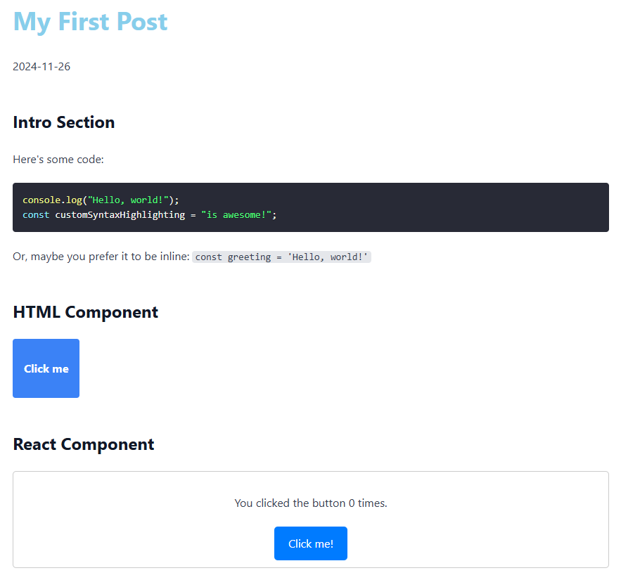
MDX also offers overwrite capabilities when compiling code. It treats its content as components so you can easily modify them. For example, you can map h1 to h2 or rewrite ems to is (see official documentation from MDX). I found that Tailwind CSS Typography didn't provide syntax highlighting for code blocks, so I overwrote pre components to provide syntax highlighting with react-syntax-highlighter. I also restyled code components (in-line code elements) to have a light gray rounded background. Here is how I did it:

First, install the syntax highlighting library:

npm install react-syntax-highlighter

Then overwrite pre and code components in PostContent. I used dracula for the example, and this blog uses prism. You can visualize the available styles here.

//import the syntax highlighting library and styles at the top of the file
import { PrismLight as SyntaxHighlighter } from "react-syntax-highlighter";
import { dracula } from "react-syntax-highlighter/dist/esm/styles/prism";

//add the components prop to PostContent
<PostContent
components={{
pre({ children }) {
const code = children.props.children.trim();
const language =
children.props.className?.replace("language-", "") || "text";
return (
<SyntaxHighlighter
//className="not-prose"
//uncomment if you want to provide your own styles
//I am just overwriting tailwind css typography color
language={language}
style={dracula}
>
{code}
</SyntaxHighlighter>
);
},
code: ({ children }) => {
return (
//I overwrite tailwind css typography styles completely for inline code
<code className="not-prose bg-gray-200 rounded px-1 text-sm font-mono">
{children}
</code>
);
},
}}
/>;

And (drumroll 🥁), here is the final result:

Content with Tailwind CSS Typography and skyblue h1

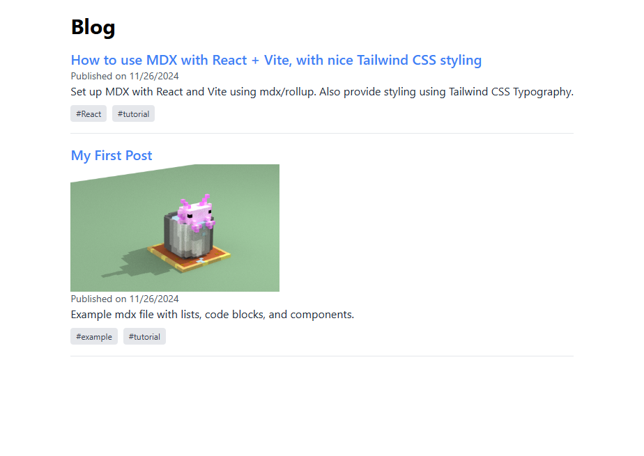
I also added some styling to the BlogList component, so the directory of posts looks like this. The code is on the step-04 branch.

Directory of Blog Posts

Thanks for making it through! You can find the live demo here. I hope this post helps you set up MDX with React and Vite and style it with Tailwind CSS Typography. If you have any questions or suggestions, feel free to reach out to me on bluesky. Happy coding! 🚀