Datadog Status Pages Color Updates
Overview
In my first 4 months at Datadog, I spent a lot of time learning about our products and what it means to be a product designer in this rapidly changing field. I want to share a project that emerged from my PM Yuta’s comment and stretched the traditional definition of product design.
Impact
Duration
Jan - May 2026
My Role
- Product Designer
- Frontend Eng
Team
- Yuta Yoshida (PM)
- Nancy Zhu (PM)
- Ryan Peffers (Eng Manager)
- Kate Ryan (Frontend Eng)
Competing Color Systems
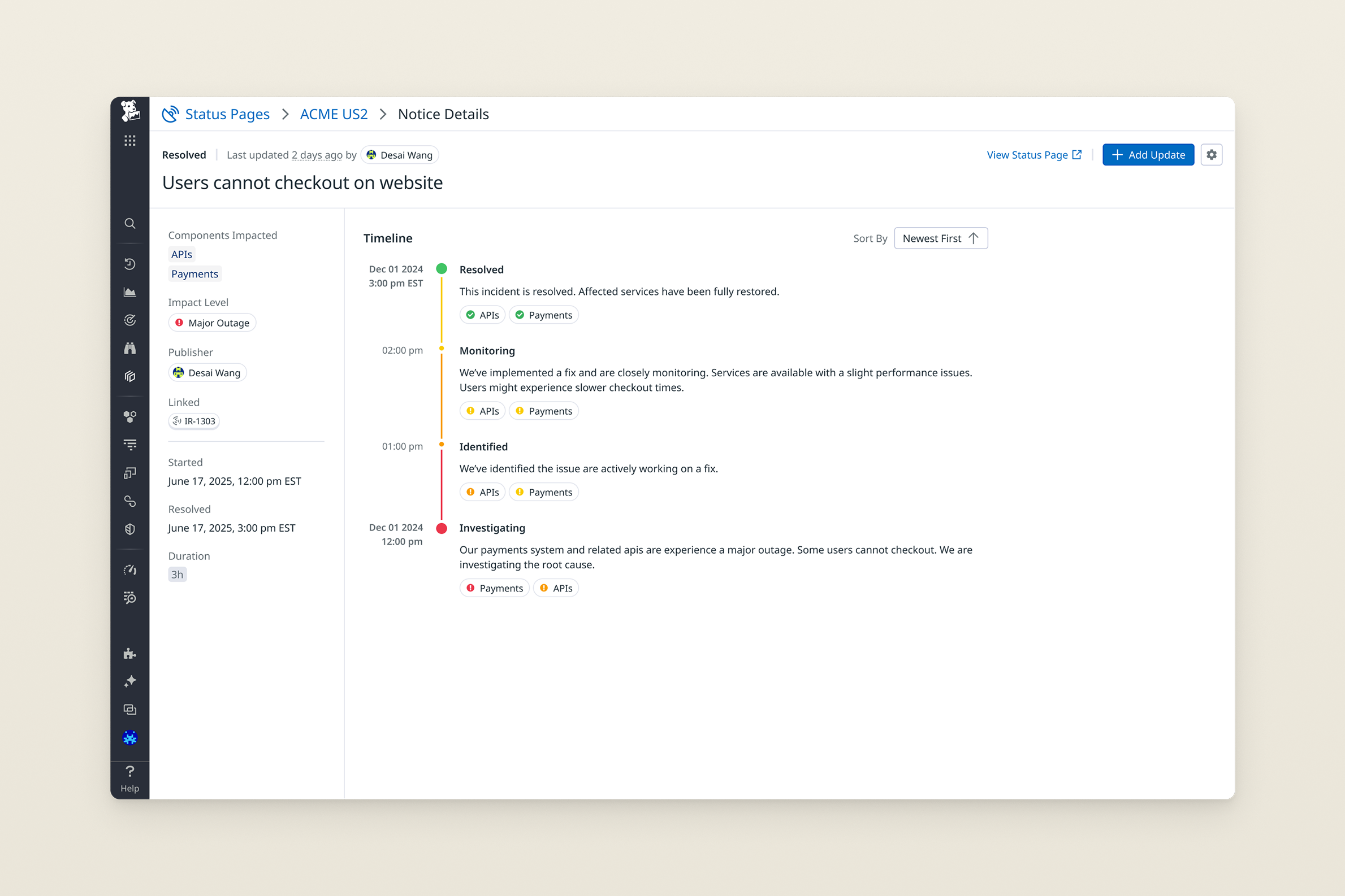
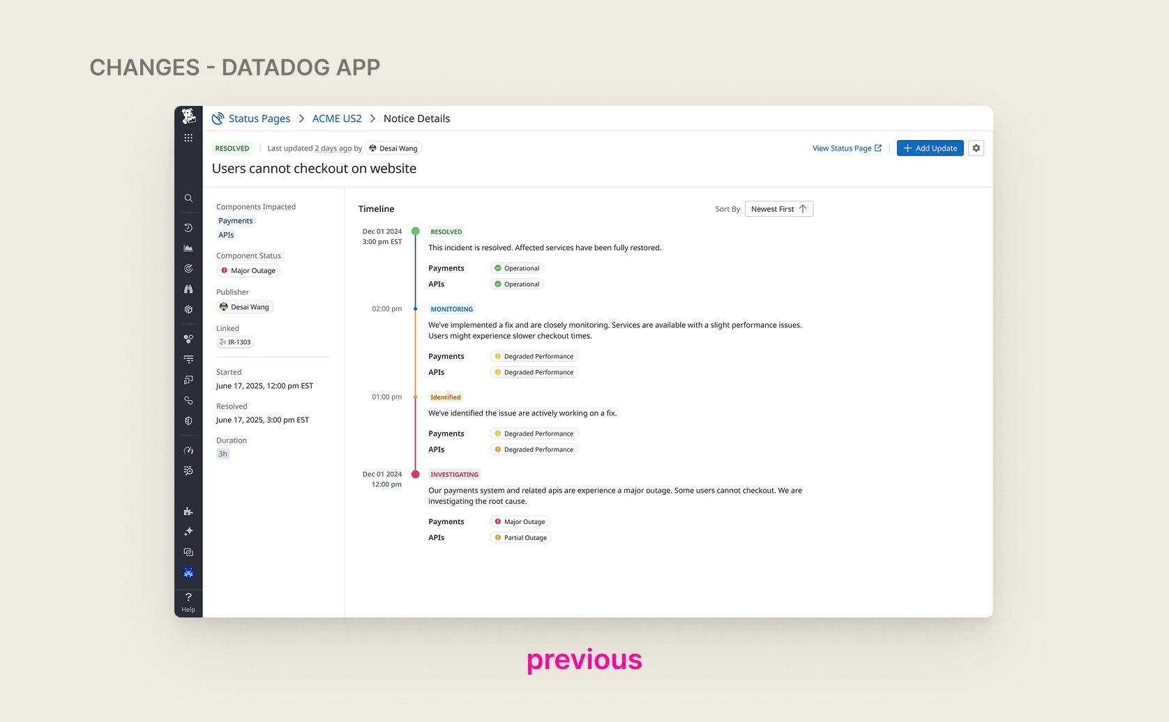
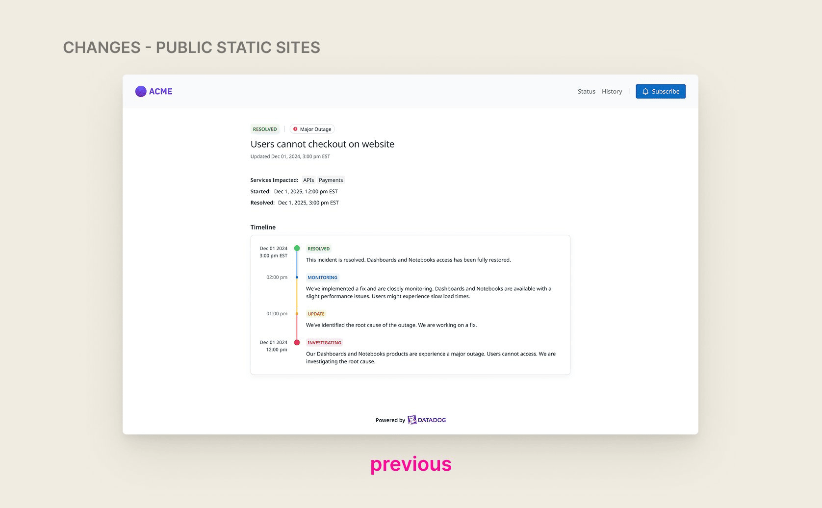
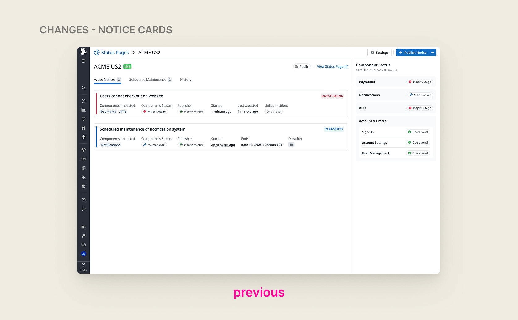
Status Pages had two competing color systems. When you post a status update — say, 'Investigating' — the update status carries a color. But individual components on the page also have colors: green for operational, yellow for degraded performance, orange for partial outage and red for major outage. The two systems collided on the timeline view, making it impossible to tell what any given color was actually communicating.
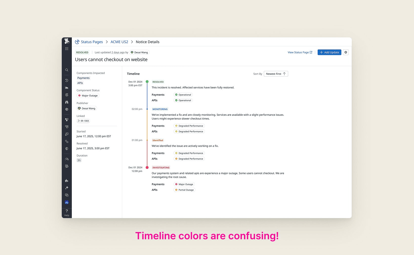
Early team discussions suggested simplifying notice status colors to red and green. But after digging deeper, I found that the problem wasn’t in the number of colors, but rather that it was confusing for users to keep track of two color systems. I proposed to instead eliminate the status colors altogether and derive timeline colors directly from component states.
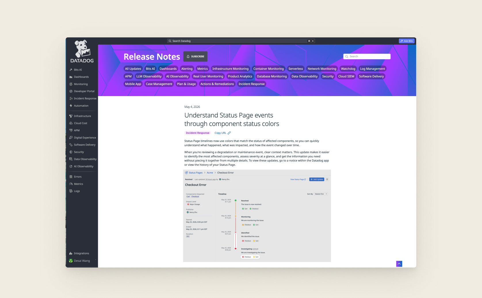
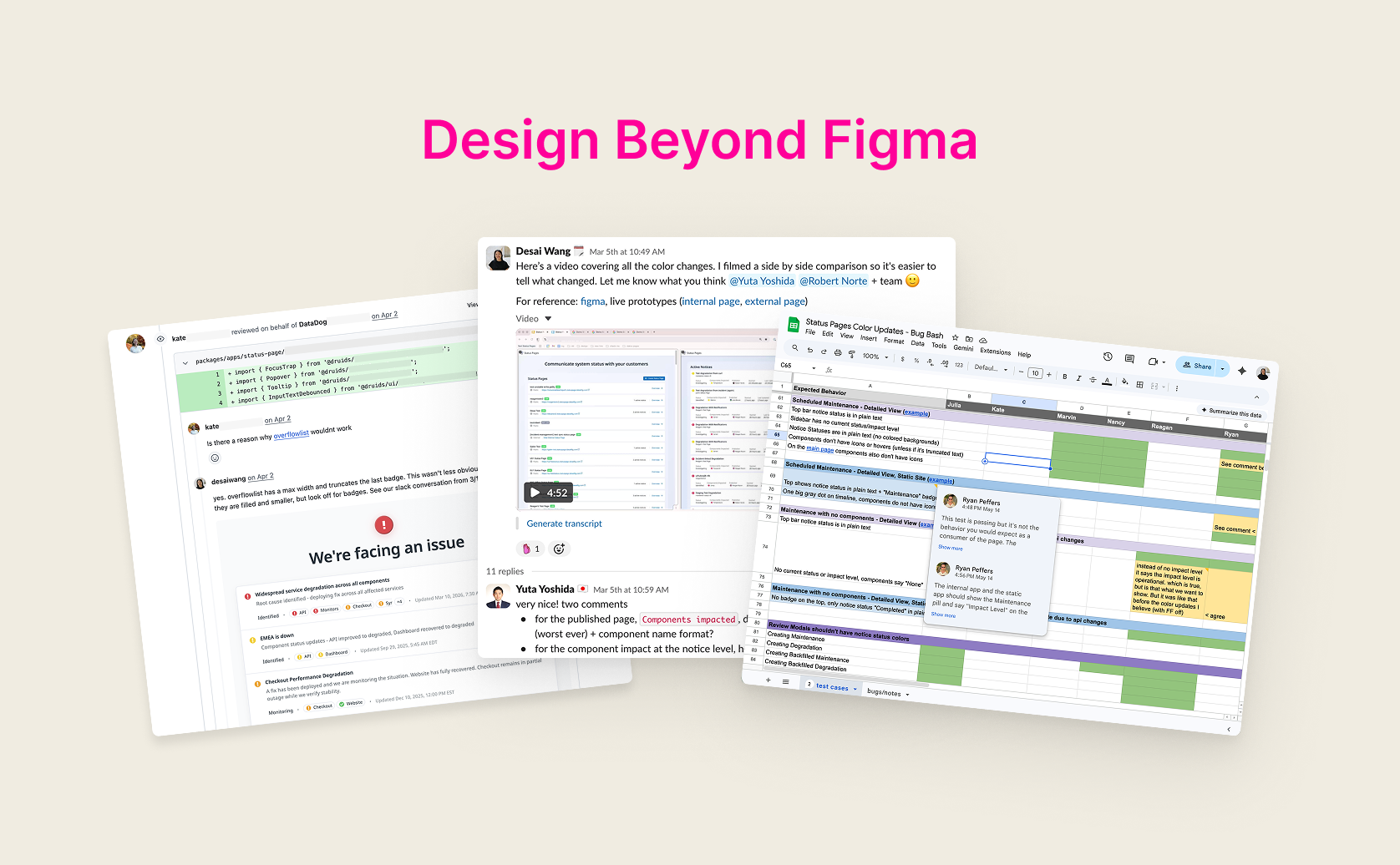
Beyond the color unification, I audited every Status Pages screen and surfaced discrepancies between the Datadog app and the public static pages. I explored design solutions for these discrepancies in addition to cleaning up colors, and aligned with engineering and product leadership through several rounds of Figma explorations alongside a prototype built directly on our frontend code base. Here are the finalized design changes:
Design → Production Code
The next step was implementation. As there has been a strong push for designers to code at Datadog, I was quite comfortable using Claude to prototype and decided to lead the implementation myself. However, I quickly learned that coding a prototype is very different than shipping a large PR.
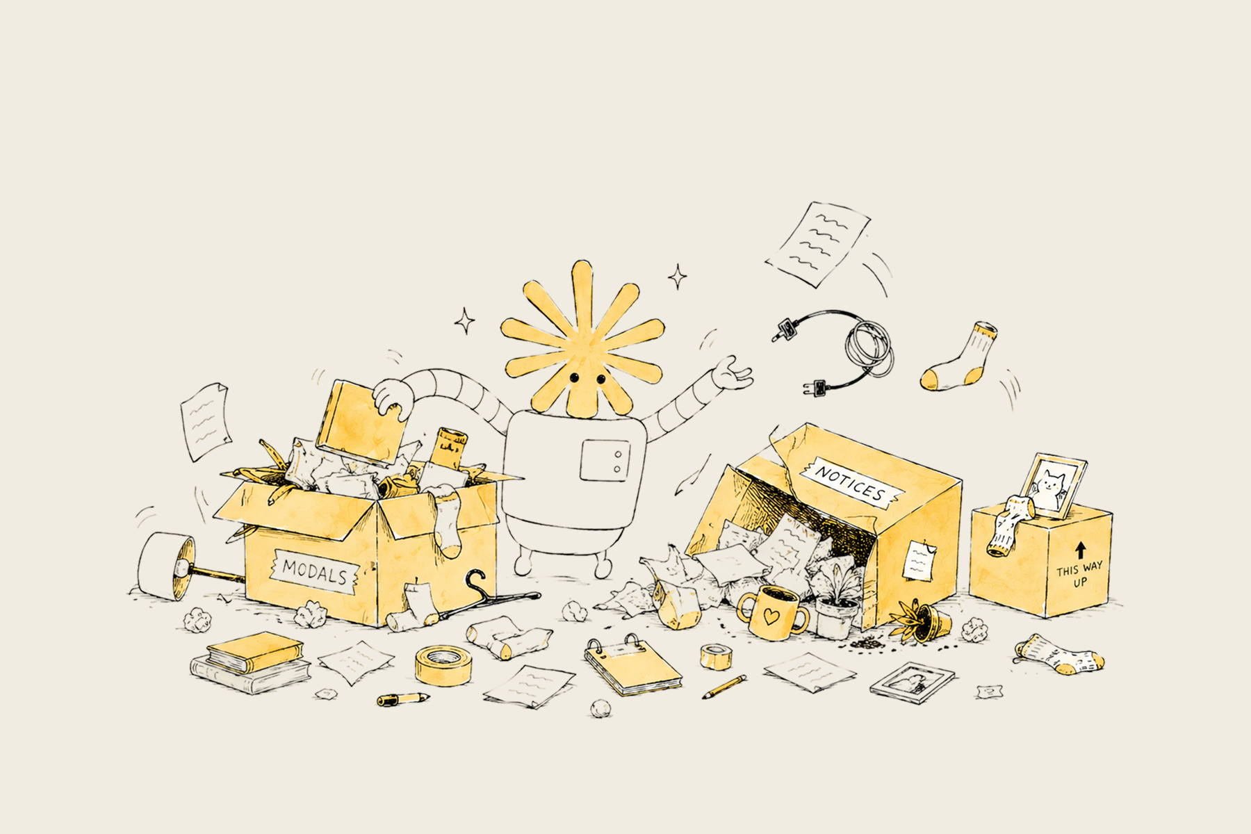
Breaking up the prototype
My prototype lived in one large pull request. Before anything else, I had to decompose it into smaller, reviewable chunks. Once that was done, I asked the engineers on my team for a code review.
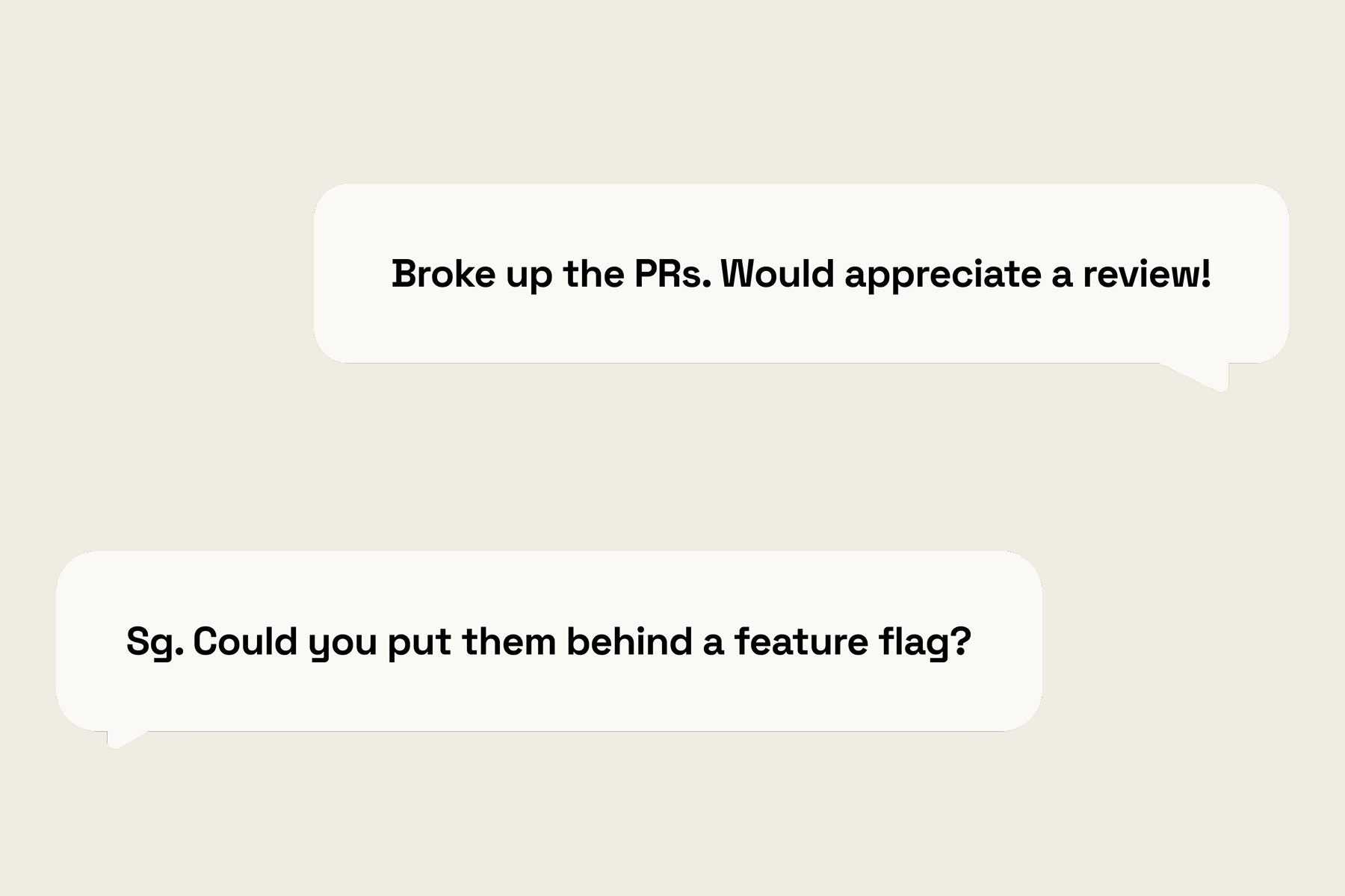
Feature flags
The engineers asked me to put the changes behind a feature flag. The web app and static sites are implemented separately, which required repartitioning my PRs.
API migration + merge conflicts
Just as I was ready to launch to production, an API migration was merged into production. Every data structure my code touched had subtly changed shape. Trying to rebase with Claude was a terrible mess, so I rebuilt the features on the newly migrated APIs.
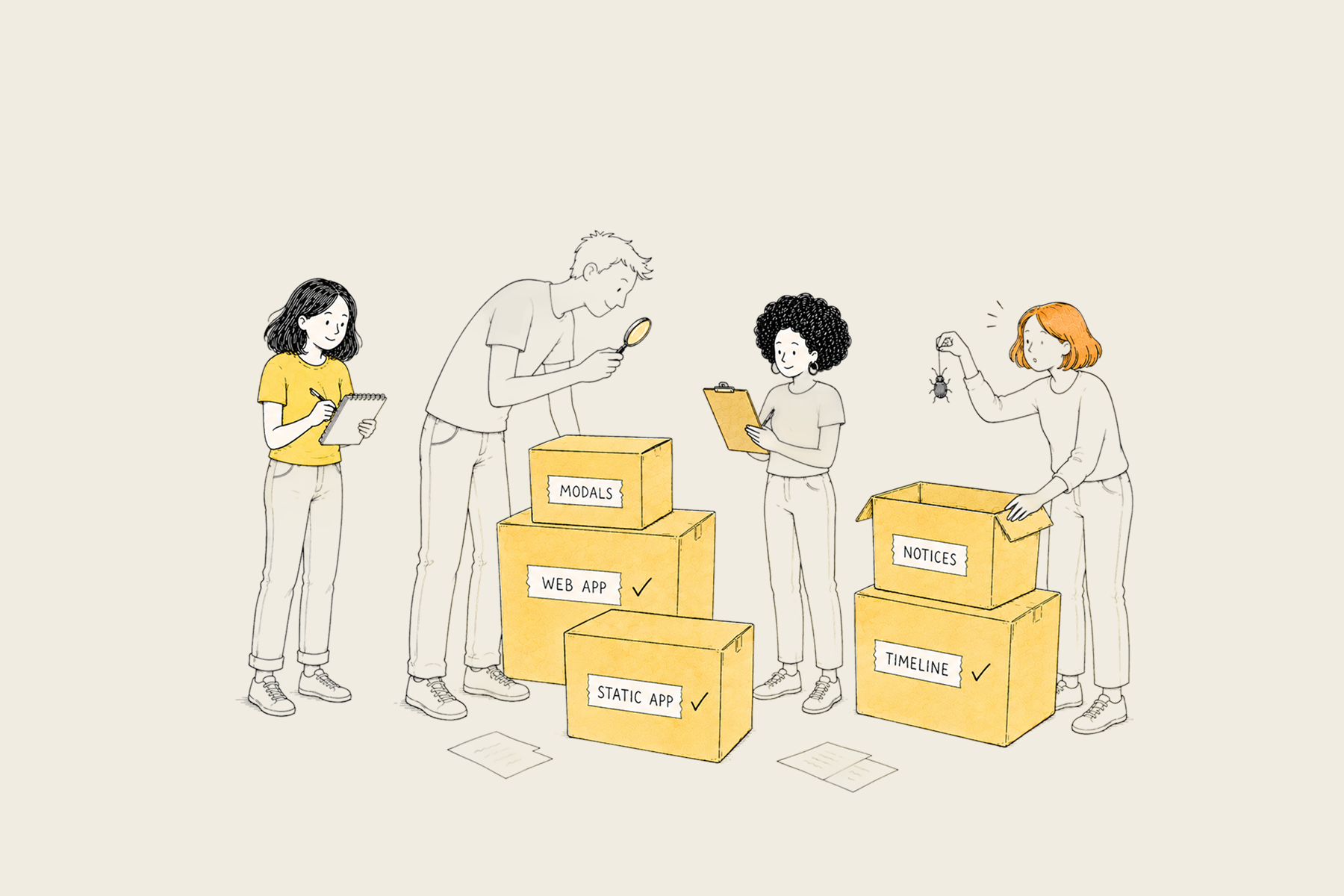
Bug bash + final polish
Finally, after a few more rounds of review, I led the bug bash for this feature. I coordinated the team to stress-test different situations and noted down feedback. I made the final adjustments and turned on the feature flag in production!
Reflection: Different Mediums of Design
While the engineering journey was tumultuous, I am grateful to have taken part in the entire product cycle. I learned that design can take many shapes. It can happen in Figma, but also through code prototypes, via PR comments, or during bug bashes.
I was initially intimidated by my lack of engineering expertise, but I think that rather than asking “should designers code?,” we should be excited that “designers can code!” Instead of treating code as something beyond our scope, we should treat it as a different medium to work with. In a world moving super fast, the most persuasive design artifact is often a coded prototype.
Finally, I’d like to acknowledge the Status Pages team. This project would have stayed in Figma without the wonderful engineers and PMs on my team, who took time out of their sprints to patiently review my PRs, explain workflows, and provide user insights. They showed me that beyond coding knowledge, trust and collaboration also go a long way :)