If you want to play with the visualization, it is here. I've also made my github repository public.
In my last year of undergrad, I took two courses on data visualization (INFO 3300 & INFO 4310). They fundamentally changed my understanding of how data can be displayed, and I saw the possibility in using interactive websites to help people make sense of otherwise inaccessible information.
Near graduation, I wanted to create a deeply personal data visualization project and was searching for ideas. As I was unsure about my career, I decided to collect data on Cornell AAP B.Arch alums. I was at around 600 data points when I realized that I was missing one key component: compensation. I wanted to visualize career trajectories, but having only the firms people worked at and their roles is too vague for gauging growth in a numerical way. I wanted to be able to estimate of how each job affected people's earnings, so I began searching for a salary database. That's how I discovered Archinect's salary poll.
I was shocked to find that it included nearly 14,000 entries from the US since 2013. It was a much richer dataset than the 600 people I had researched, so I decided to take a short break and quickly make an exploratory tool for these surveys (spoiler: it ended up taking me a month).
I used python to query and clean the data. And the visualization is created with HTML, CSS, Javascript, and D3.js.
Data Query and Cleaning
After playing around with the Archinect site, I realized that information is retrieved from their database via GET requests. The requests also include parameters that correspond with the filters on their site, as well as a number to limit max responses. I set the country to United States, and the number to an arbitrarily large number (15,000) and used python to simulate a GET request to the server. After examining the information I received from the server, I realized it was not raw survey data but instead pre-rendered html (essentially a webpage page with 13,000+ entries). So I used a the popular python package beautifulsoup to parse the html back into raw data.
I removed obviously wrong entries (18-20 year old earning 200,000+ per HOUR, repeated entries with invalid salaries, misclassified location such as Shanghai with salary units in Chinese Yuan) and used Nominatim library to add the longitude and latitude for each location. You can download my processed data here, it is a csv file with archinect_salaries_fulltime in the title (date prefix shows last updated time).
Inspiration
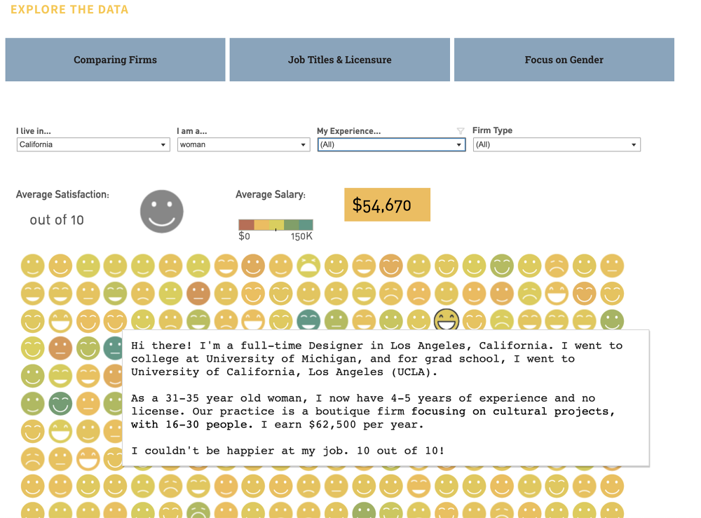
Lian Chikako had visualized this dataset back in 2015, and she had a graphic with rows of emojis that represented individual's satisfactions. It allowed users to filter by geography, gender, experience level and firm type, and upon hover on each emoji showed a summary of the corresponding survey in narrative form. I thought this was a brilliant idea, but the different emojis (big smile, small smile, no expression, slight frown, big frown) were a bit hard to distinguish. I also thought the color scale that corresponded to salary was a bit hard to see as well. So I set out to redesign this system.
Positioning Circles
In my first iteration, filtered data points were shown as circles and I mapped satisfaction to color and salary to circle size. However, I didn't like how the points were appearing and disappearing, it also lacked a sense of the whole. So I wanted all the points to be visible, but the ones that don't meet the filtered criteria to be greyed out. I toyed with some different iterations of this, and at one point wanted to achieve a fizzing effect when circles move to the top. In the end, I made the circles stay in place and not move to the top in order to preserve the relationship between the surveys. For example, if they are sorted by date of the survey, then this order is always preserved.


Linked Filters
Filters are the main way users interact with this site, so I wanted to make them informational and fun. I created histograms and density plots that not only show distribution within categories, but also allow users to filter the original dataset. I also made all histograms and density plots update anytime any filter changes.
To do this, I stored the filter functions in a map where the keys are the categories, and the values are the filters (if any) on the categories. The histograms and plots are created as class objects with an update function. Whenever any histogram's or plot's filter is changed, all the other histograms and plots are updated. The update function applies all filters except for the filter for its own category on the original data to recalculate the distribution. I ignored the filter in the plot's category because otherwise it won't allow for interactions. For example, if Corporate is selected as the Firm Type and the Firm Type filter is not exempt when calling the update function for the Firm Type histogram, all the other non-selected bars would disappear and the user will not be able to toggle to another firm type.

Since the filters are constantly changing, updating 13,000+ circles elements inside an svg was causing some noticeable lags, especially when filters on the density plot for salary was dragged. To keep the interface sharp, I instead render the circles in a canvas element.
I also added a brush filter behind the histogram plots so it's faster to select multiple categories. Initially single clicks toggled a bar between selected and un-selected, and double clicks focused on a single bar (all the other bars automatically unselected). However, during user testing with my friends, Jack suggested that it's more intuitive to style the bars like radial buttons and use shift + click for multi-select. I tried this out and the interactions on the histograms drastically improved, thanks Jack!
Sophie and Helen also recommended having a way to reset filters, so I added a button to clear filters in each category as well a button at the top to clear all filters on the dataset.

Hexbin Map
It was hard to synthesize trends beyond distributions in the individual view, so I wanted to add some way to summarize the data. Since there are more than 10 categories, it would take too many graphs to explain correlation and trends. So I decided that I would create some static visualizations with explanations in a separate article, and this visualization will be stand-alone and serve open user exploration.
I did want to summarize results by geographical locations, so I chose to add a hexbin map. The map divides geographical area into hexagons, where each hexagon contains all data points that fall within its boundaries and can be used to create generalizations of the data points. For example, I calculated the mean job satisfaction, median salary, percentage of male/female, and most common location name. The hexbin provides a much better overview than a bubble map, where circles are centered at particular locations. For example, Jersey City, Hoboken, and Manhattan have three separate circles in a bubble map while in the hexbin map they are aggregated in the same hexagon.


Customizations & Legends
To lean into the power of interactive visualizations, I wanted to give people the ability to customize visual channel's corresponding data. The default view of individual surveys maps income to circle size and job satisfaction to circle color, but I wanted color to be able to correspond to age, gender, years of experience, firm type, and more. For the hexbin map, I also wanted the user to select different categories to map onto the hexagon color and size channels. To distinguish between all the different color mappings, I tried to pick color scales that were differentiable. However, this was quite difficult since there are so many categories!

A technical issue I experienced was mapping categories to colors. A lot of the numerical survey data were in categories (for example, the survey didn't collect specific age but rather asked users to select from predefined groups like 20-25 or 25-30) and there's no way to map them directly to colors. Further, I couldn't use d3's color scales out of the box because the lighter colors blended with the greyed out circles or the background. Instead, I had to customize the range of the colors, and to first map the categories to a value between [0, 1] and before using them in the color interpolation function.
Wait, things are getting too complex too fast—and what do these colors mean again? To counter the confusion that these colors brought, I added a section for legends. Further, when a color mapping is selected in the individual survey view, I automatically expand the filter corresponding to the category and also apply the color scale on the filter.


Responsiveness and Mobile User Interface
Just as I was about to throw my hands in the air and proclaim this project finished, I realized that things started breaking if I resized my window or visited the site on my phone. I was aware of different screen sizes so I had made a function to resize the grid for individual circles based on window size. The hexbin map also had a viewbox property that automatically adjusted map size based on available space. However, the individual circles were not responsive to finger dragging motions, the tooltip upon hover was too big, and the hexagon size legend did not change when the map changed sizes.
The tooltip problem was the most straight forward. I used media queries to create an alternative set of styles that were applied for smaller screens. However, the other two problems were much more difficult. To recognize finger motions, javascript provides event listeners for touchstart, touchmove, and touchend. However, these controls are also used to scroll through a page. In order to distinguish between hovering over points versus scrolling, I created a function to calculate the direction and magnitude of finger movements. If the direction is within a threshold of straight up or down and the change in y position is relatively large, then no hover events are triggered and the page instead scrolls. Alternatively, the movement is treated as hovering over circles. While this should work in theory, I noticed a strange behavior while user testing. Only if the touch event is triggered slowly (there must be a slight pause between finger touching the screen and initial movement) is there a separation between hover and scrolling. Otherwise, the screen might scroll while the user is hovering, and while scrolling some hover events might be triggered. I suspect there's something wrong with how I'm handling touchstart events, but after extensive console logging I'm still not sure what exactly is causing this problem. While this is slightly annoying, it doesn't interfere too much with site experience.

And to resize the scale I've adopted a very hacky solution. I appended the size legend to the div that also contains the hexbinmap so they scale together, and then made a copy of it for the side bar (the original one is hidden using display:none). This is great because styles on the div handle resizing automatically, and I don't have to calculate scaling proportions. However, one downside is that text on the legend is also scaled and can become difficult to read. For the mobile interface the hexbin map needs to be zoomable (otherwise the hexagons are too small), but this poses further challenges for the scale. I would need to know both how the map is scaled by the viewport as well how much a user has zoomed. In the interest of shipping the visualization, I skipped this feature for now and instead disabled hexbin feature on smaller viewports. I also think that the side bar should be restructured so that the data summary (median salary, mean satisfaction, number of surveys) is completely visible while the user is changing features. I will work on these feature if time allows.
Adjusting for Inflation
After I launched this visualization, many people pointed out that salaries were lower in the earlier surveys because they are not adjusted for inflation. This skews any observation between salary and other survey categories, so I decided to introduce a toggle that allows users to switch between income from survey responses and income converted into 2024 dollars. To adjust past income to today's standards, I calculate inflation rate by dividing current Consumer Price Index (CPI) by the CPI when the survey was taken. I used the average CPI data for US cities found here.
I chose to keep the income survey responses so users can still see the nominal values from the past. This could be useful if they were interested in comparing their salaries in the past to this dataset, for example, filtering for all salaries in 2013 and seeing if their salary in 2013 was above or below the median. The visualizations and interactions remain unchanged otherwise.

I was also curious how the salaries increased over the years compared to CPI, so I plotted both on a line graph. Shockingly, the median salary growth in architecture exceeded that of CPI. Yet why do people feel that pay has not caught up with inflation in recent years? I tried to make sense of this by analyzing housing prices, a major expense aside from consumer goods. The US House Price Index has nearly doubled since 2015—far outpacing inflation! I think this has definitely contributed to the common perception of lagging salary growth.
Further, I wondered if the lagging salary growth is limited to the architecture profession. Are tech salaries growing much faster? After looking at the median salary growth for Google software engineers, the answer surprised me: no, the trends are similar to those in architecture salaries. So, is it just that software engineers make much more to begin with? (The 2024 median salary is $179,000 for Google software engineers vs. $82,800 for architects. The contrast is also more drastic than the difference between these two numbers because $179,000 is the median for people with the title "software engineer" exclusively and does not include more senior employees or executives while $82,800 includes all roles in architecture.) I'm not sure, but I would love to hear from those with more insights.

I used h1bdata.info to calculate median income of Google Software Engineers. Google definitely represents the high end of tech salaries, but this was the most comprehensive dataset I could find that also has breakdown by year.
Takeaways
This project took me much longer than expected, but it also taught me important lessons in terms of designing an interactive visualization. Here are my key takeaways:
-
Define user goals before implementing any feature
- For example, is the site for exploration or synthesis?
- What kind of data do the users need? What kind of data viz best suits their needs?
-
Make all components compatible for both desktop and mobile devices from the beginning
- All components should have responsive layout
- Design for multi-touch devices alongside desktop developments
- Test frequently on different devices
-
Incorporate user feedback into development process
- Ship while building and be okay with showing people the "raw" version
- Break the complete product into components and ship after each sprint. Gather user feedback and improve upon the pain-points.
Side Note (the internet can be dangerous!)
I really miss the studio environment where I can elicit feedback from people around me, so I tried to publicize this project across a variety of platforms such as LinkedIn, Archinect, Reddit to get some conversations going. People were generally very kind and shared a lot of insights, but the internet is not without its perils. The first time I posted on Reddit I got some excellent feedback, for example the observation about inflation. However, as my account was brand new and I had no previous activity, I got shadow banned very quickly for being too active in the comment section.
After waiting for a few days and implementing the inflation toggle, I decided to make another account and posted again on reddit. This time, I was deluged with people questioning my visualization as it doesn't provide much synthesis. People complained about how there's no clear display of correlation, the dots are positioned quite arbitrarily, so on and so forth. I think their observations are relevant, and I definitely could have done a better job displaying the correlation information. Yet I thought that synthesis would be better suited for article format, while this visualization should be standalone and interactive. I think another factor that resulted in this influx of negative emotions is my wording. This visualization is not about the relationship between salary and satisfaction, but rather it serves as a tool that allows people to filter data quickly and to speculate about relationships that could exist.
For a future blog I plan to breakdown the correlations within this dataset. For now, you can see some of initial visualizations in this project's github repository. The specific file is data/exploratory_viz.ipynb.
Thanks for reading until the end. Please reach out to me via email or LinkedIn if you have suggestions for this project, and I'm always open to collaborations! I'm also exploring bluesky and posting informally about my projects if you want to follow along.