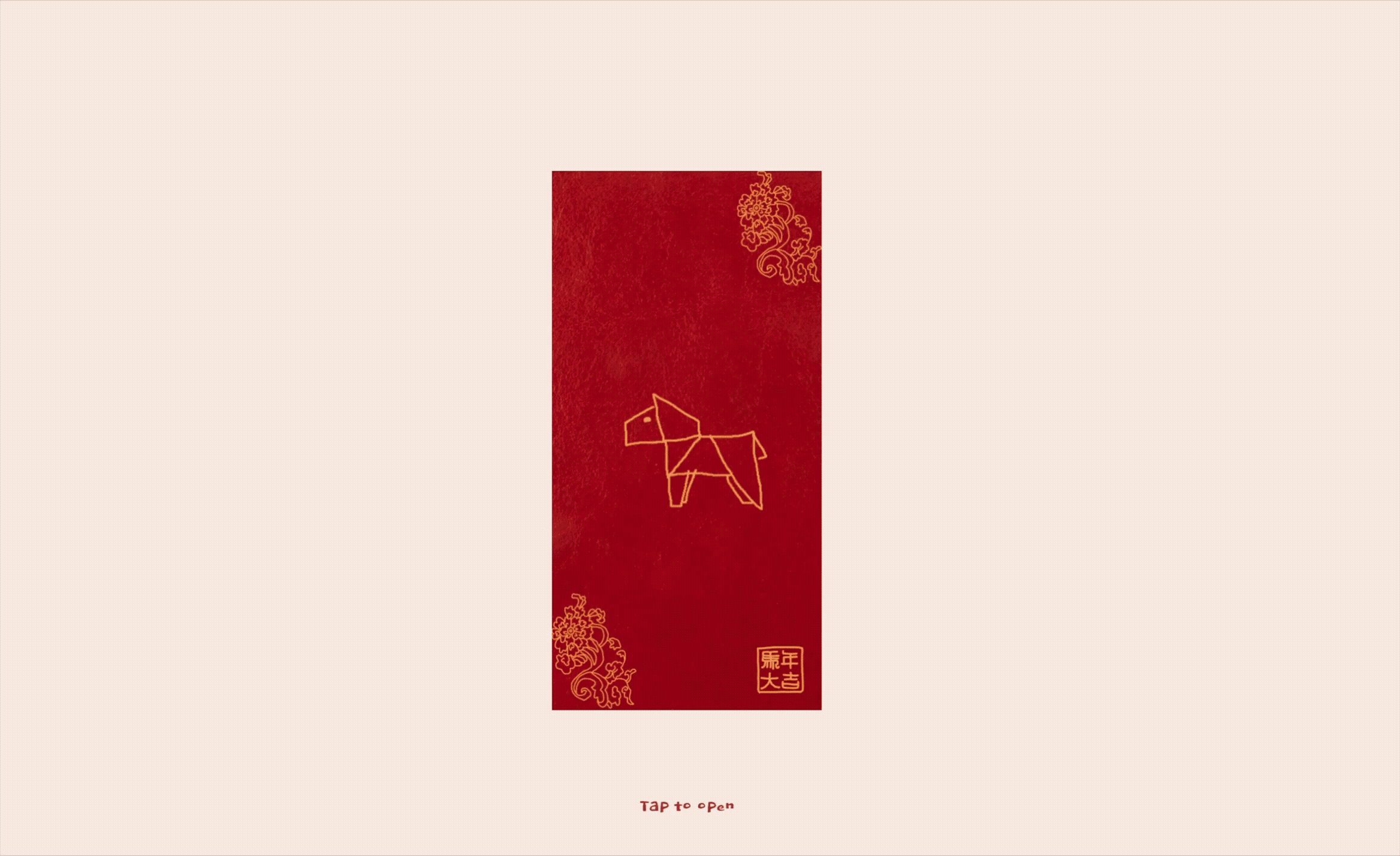
For Lunar New Year, I created a hongbao app that allows people to customize red envelopes with their own drawings and send messages to their friends. I had just started my maker instagram, and wanted to create something that would appeal to the mass public.
I've always been facinated by movement, so I decided to create a hyper-realistic envelope using three.js that can capture the slotting of the envelope flaps. I also wanted the drawing process to be easy, and the sending/receiving flow to be seamless. I spent a lot of time thinking about what the hero reel would be, and how I could post at the "perfect time".
After a lot of excited nights chipping away at the animation, I got the envelope to work as intended and posted my carefully-crafted videos. But like many of past projects, I also burned myself out. My most popular reel received more than 8000 views, yet that still felt, somehow, not enough?
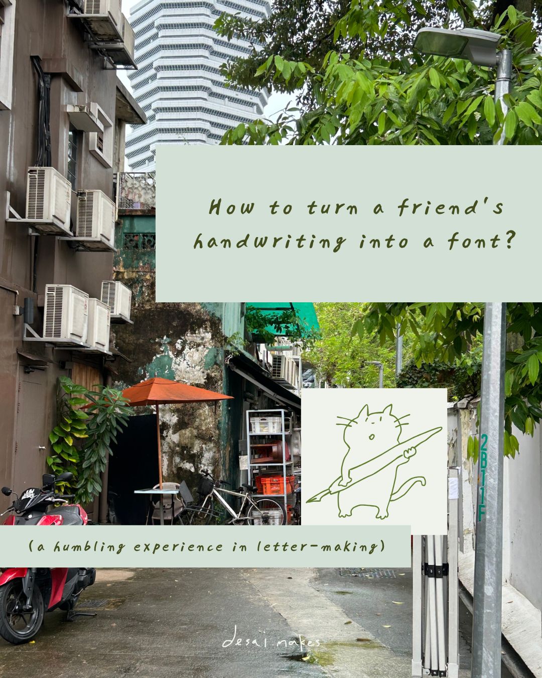
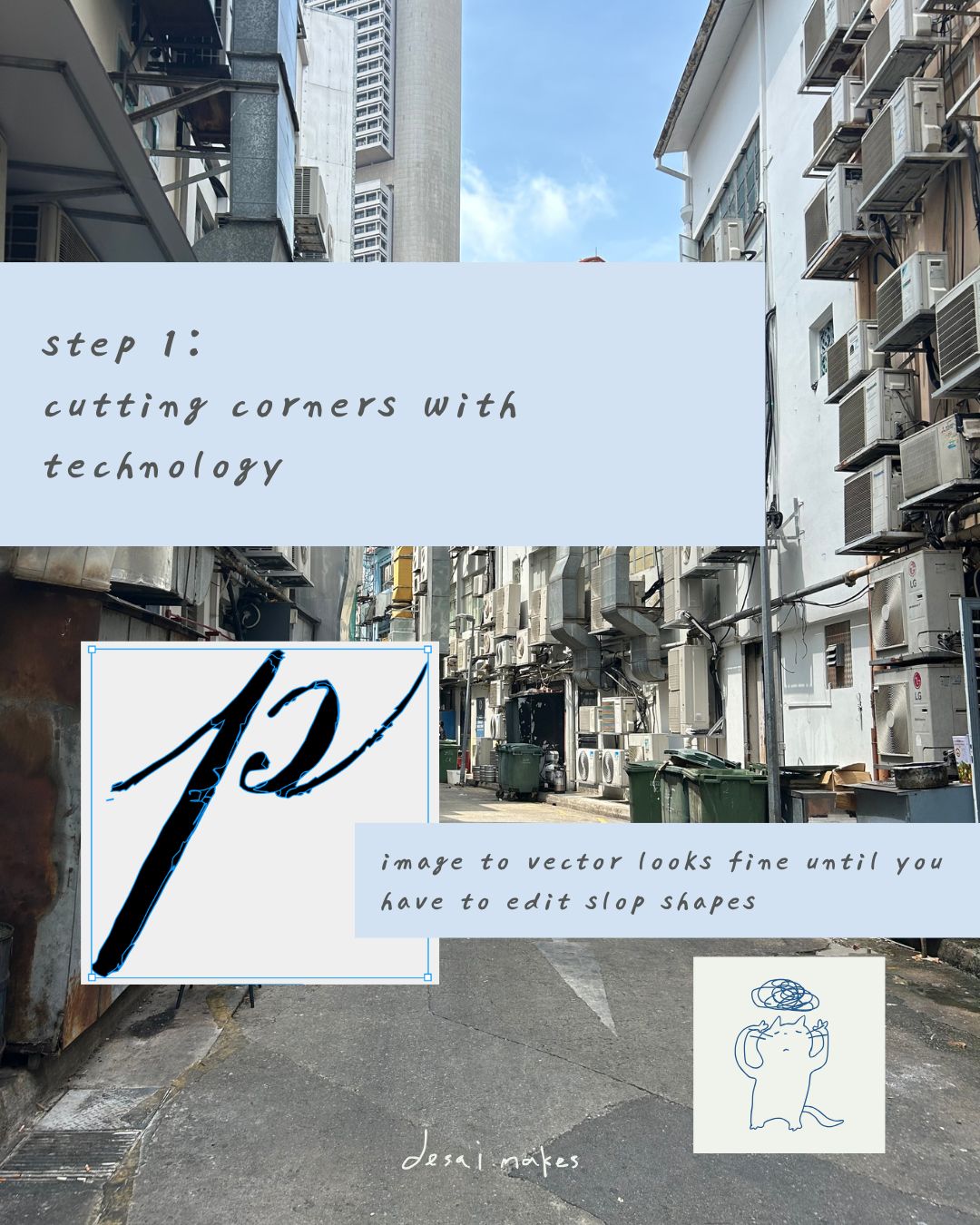
At that point I had my mind set on creating a font for my friend Camille, who wrote me a lot of letters while I was in Singapore. Ryan hosted a vibe coding session on President's Day, so I spent the afternoon scanning her letters and using Figma's image to vector tool to convert them into svgs. I had a working prototype by the end of the day, but the letters didn't connect well and the converted svgs were difficult to edit.
I started with a mass production mindset. I wanted something fast (hence the image-to-vector) and easy. The easiest thing to do was create a digital canvas that would allow others to use her font, and I was thinking perhaps I could reuse the hongbao backend code to allow people to send letters to each other. Yet as I looked at the sloppy svg outpurts, I decided to I decided to re-draw everything myself from scratch. Her letters had a human touch, and I wanted to preserve the handmade element.
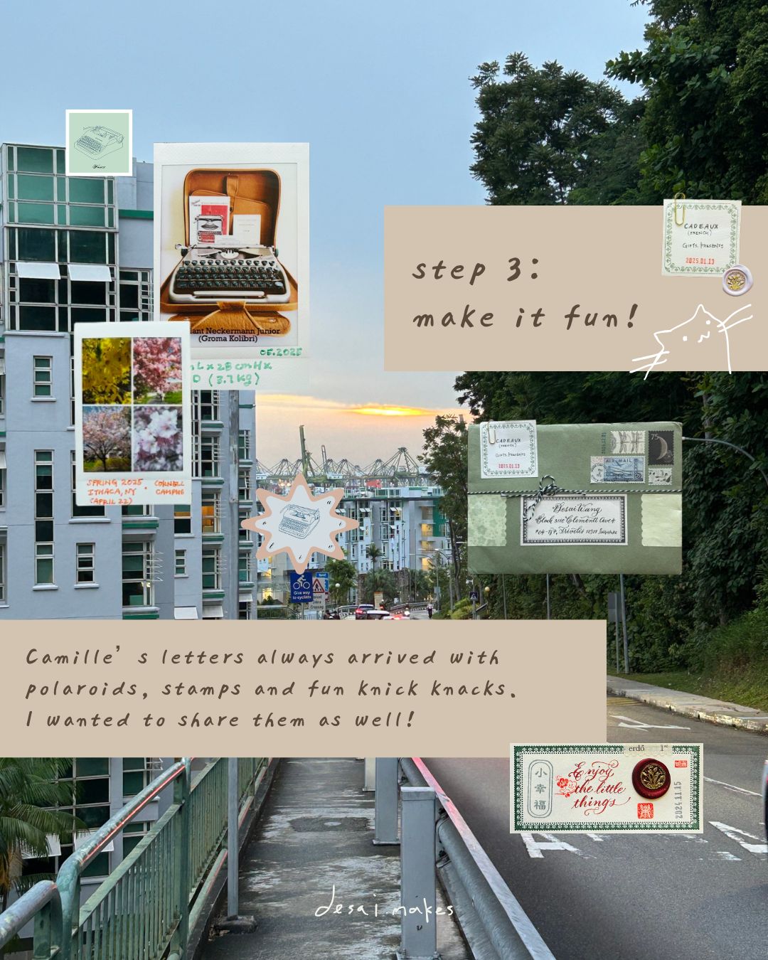
And as I spent more and more time tracing her letters, then numbers, the punctuation, I thought: why not capture other parts of her letter too? Not only were her letters expressive, they also came with exquisite packaging. They were often tied with lace-like strings, sealed with wax, peppered with stickers and stamps. Often there would also be notes or handmade bookmarks paper-clipped. I loved untangling the strings and gently lifting the adhesive elements, to then cut open the spline of the envelope and slide out the wad of papers.
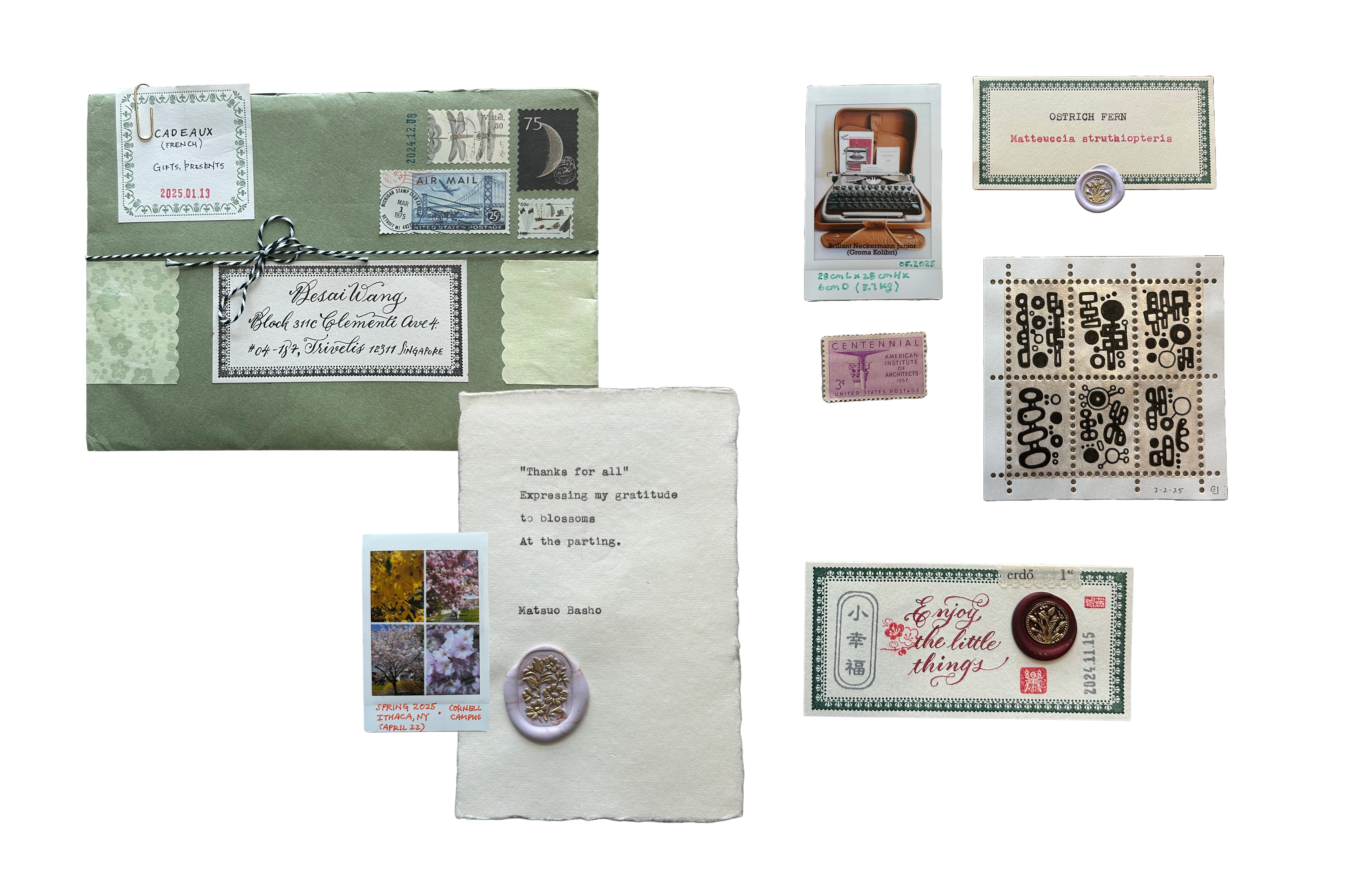
Camille loves different ink colors, and that made me love them too. There is Whisper Red from Robert Oster, Peach Haze from Diamine, Mysterious Blue from Waterman, Helianthus from Rohrer & Klingner... She can go on pages after pages talking about different pens, inks, and fonts, and I loved seeing different colors appear as I turned a page. This 94 glyhph-creation journey was slow, but it felt meditative to relive through those hot, sweaty, sometimes lonely yet shimmering days in Singapore.
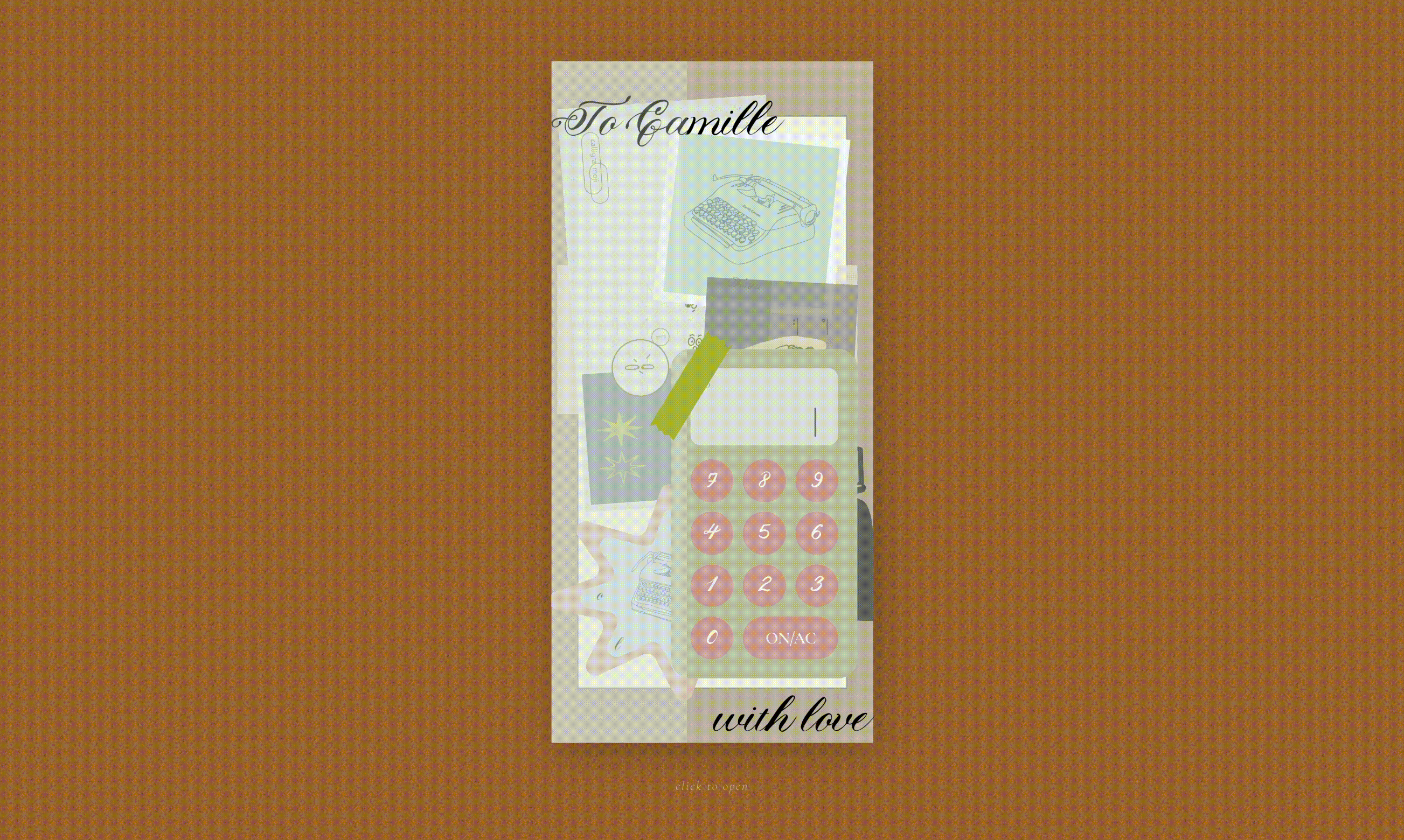
I am reminded of sitting on the SDE4 patio and taking Spencer and Elan's course on Gift Interfaces. One time, we had a guest lecture from Laurel Schwultz. She mentioned a birthday website her friend made for her, and it's special because it is intended for one person, on one day. And that somehow felt special. It reminded me of site-specific architectural interventions (often land art) that were beautiful because they spoke to their sites, and I thought: why not make the opposite of the hongbao app, and make a letter just for Camille?

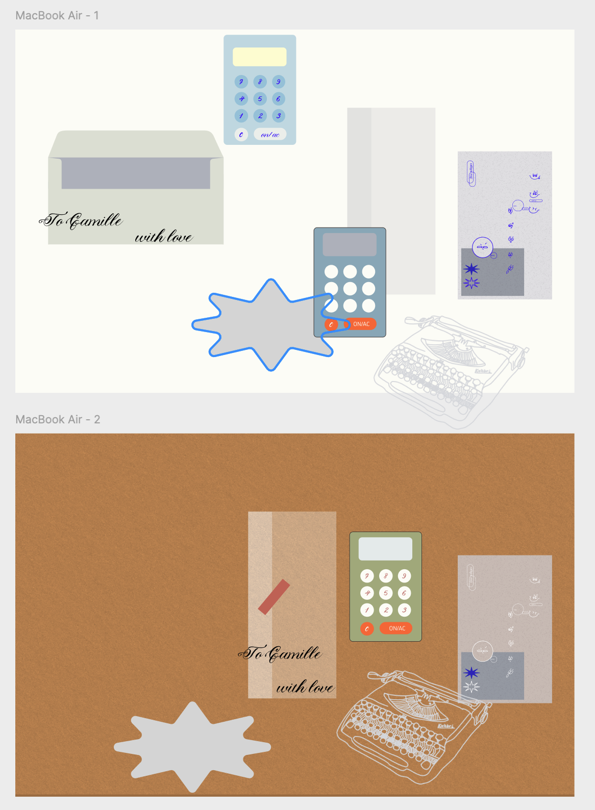
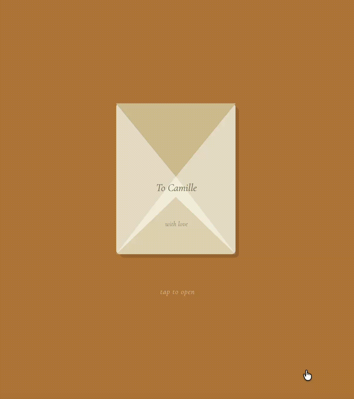
So, I went all out to make the letter feel like Camille. I drew her four typewriters, the calligramojis she minted and named. I also recreated her number system with a interactive visualizer, and added the inks she loved to use. And of course, the letter is the center piece. I fell in love with a semi-transparent envelope, because it allows the knick knacks to be seen before opened (I thought this would give some tactile understanding of what the letter contained without being able to touch it). Then, to capture the excitement I experienced, I created a stop motion of the letter opening and revealing all the knick knacks. Of course, at the center of the screen is the letter that started all of this.
Please play with it here. Let me know what I should add next!