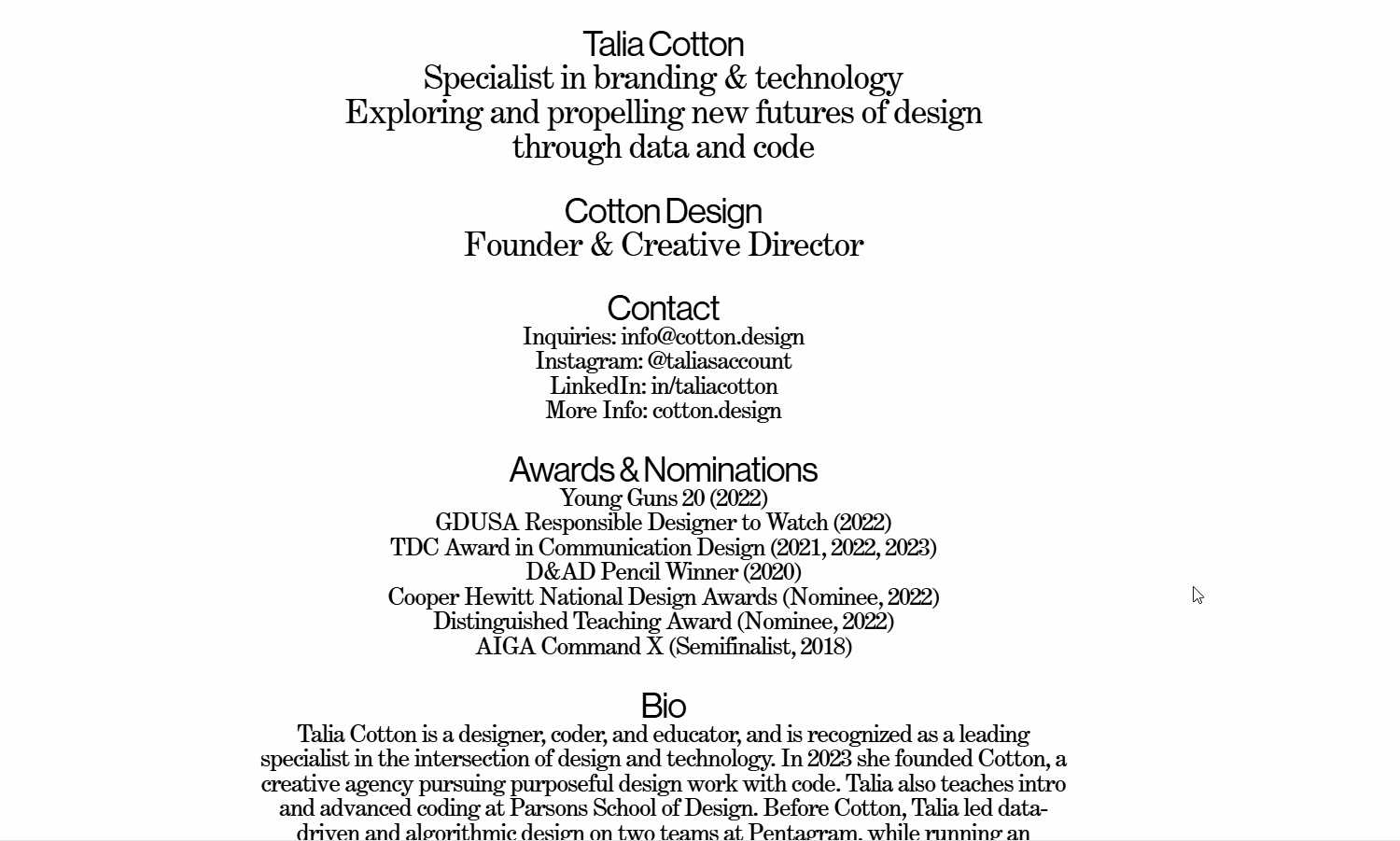
When I first visited Talia Cotton's website, I was amazed. When I hovered over characters, they would reveal tumbling and rolling shapes with fun gradients and blurs. How did she do it??? In this blog, I want to break down the logic behind the animations, how I ported the original html/css to React, and some accessibility improvements I made.
Logic
If you highlight the text while they are in motion, you can tell that each character is acting independently. After examining the source elements, I realized that each character is wrapped in its own span. Further, during the animations the characters do not disappear but instead becomes transparent. Each character has parameters that control how it looks when hovered, and these parameters can broadly be grouped into two: geometry, and animation.
Geometry Parameters:
- background color: in Talia's example each character has a two-color gradient
- shape: either round or rectangular, which is controlled by border-radius
- blur: also controlled by radius
Play with these settings below.
Animation:
- rotation direction: clockwise or counter-clockwise
- rotation time: how long does each rotation take?
- animation duration: how long does the animation last?
- scale factor: does each character change size?
- displacement: does it move at the beginning of the animation?
Hover to see animations.
Putting things together
Hopefully playing with the interactive elements helped you gain a good understanding of the parameters! And lastly, we just need to add some randomness to diversify possible parameters upon hover. Instead of a set value for each parameter, we need to select a range and dynamically generate values for each character.
The default values are what I set for my own website, feel free to play with them to make your unique animations!
Come & play with me :)
Final touches
Do you notice anything different between the version you were just playing with and the final version in the header and footer?
If you noticed that the shapes are not blending nicely, then you're absolutely right! There's one more thing we have to do with color blending and layering. To make the shapes seem more 3D, Talia added a hard-light blend mode and also used z-index to randomize the order of the shapes to create more intersections (otherwise the newest created characters would always be on top). I've added controls for z-indexing and blend modes below, take some time to tinker with them.
Switch up the blend modes!
Now that you've gained an intuition of the different components that enable this text effect, let's dive into the code! Oh and, if you played around with the settings, I've synced your options with the rest of the site. It's only available to you, and will be reset if you reload any page. The biggest text playground is the home page, feel free to enjoy your creation there!
Code breakdown
I've created a React component CharacterWrapper that makes use of three helper functions wrapCharsInSpans, useCharacterAnimation, and useTouchAnimation.
Splitting sentences into characters is quite terrible for accessibility as screen readers cannot piece them back, so I wanted to improve upon this in my version of the code. I do this by hiding the split component with tag aria-hidden set to true, and I render a copy of the original component with class sr-only.
I also made improvements to encapsulate the blending within each CharacterWrapper component. That is, the colors applied to animation will blend with each other but not with the background of the page or colors of other external components. I do this by applying style isolation: isolate at the top level and propagating it down using isolation: inherit in children props.
Aside from readability and style encapsulation, I think the React implementation of Talia's original code drastically increases performance and modularity. The original code queries the entire document for spans with a certain class, splits them, and attaches hover behaviors, so it's very difficult to create different variations of the hover effects or dynamically manipulate styles. I am only able to create an interactive blog post like this thanks to React!
Ok, here is CharacterWrapper.jsx and the accompanying styles CharacterWrapper.css. Make sure to import the styles, which controls transitions for the animations and resets the character afterwards.
Animation function
createCharacterAnimation manages hover styles that we've just discussed in the previous section. It applies styles dynamically for each character upon hover and also removes them when animation duration is up.
Wrap characters in spans
wrapCharsInSpans takes a string or a React element and wraps each non-space character in a <span> with a class name "blooms". It also attaches an onMouseOver event that triggers shapeAnimation on hover. The blooms class is important because we will use that to identify interactions on touch screens and also apply animation transitions.
Note that if an element is a React element and not a string, this function will recursively process its children and add isolation: inherit to its style. As mentioned previously, this works in conjunction with a isolation: isolate style applied at top level to prevent the characters' color upon hover from blending with other components such as the background.
Touch Events
Finally, let's handle touch events. Unlike mouse over events on computers, touch events need to be handled separately because they are often blended with scrolling. We want the effects to be triggered whenever the user touches the text, even when they are scrolling!
The hook is designed to handle touch events for an element and trigger a provided animationFunction whenever a touch interacts with a specific target element inside the wrapper. It can receive different wrapperRef and animationFunction so that different animations can be applied to different components.
Allowing for interactions
If you are wondering how this blog post is possible, I created a slightly different version of the createChracterAnimation function that takes in parameters instead of having them predefined. These parameters can be set by me (in the first examples of this blog I hold the parameters that haven't been introduced constant), or they can consume states from a context provider.
To illustrate this idea, let's look at the scale parameter. In the createCharacterAnimation I shared above, this is randomly selected from a predefined range within the function: const scale = randomValFromRange({ min: 0.75, max: 2 }); However, my version of createCharacterAnimation takes in an argument that defines this range. For the geometry example min & max are set at 1, for the animation example min & max are both set at the value of the scale slider, and for the final example it is set according to the min & max of the range slider for scale. The range slider's values are stored in a context that is consumed by the rest of my site's text animation components, so their scales are also altered.
This can be very confusing if you are unfamiliar with React states and contexts, but the official React site does a good job explaining them if you want to learn more!
Closing Thoughts
This text effect was one of the reasons that motivated me to create my own website from scratch. I wanted full control of how things looked and behaved, but I didn't realize what this meant until I was faced with literally a blank screen: I had to choose the fonts, design the layout, even handle the routing myself! I've learned a ton about javascript, css, and React while building this little online nest of mine, and I'm super excited to share more with you. Thanks for reading until the end, and hope you've had fun!