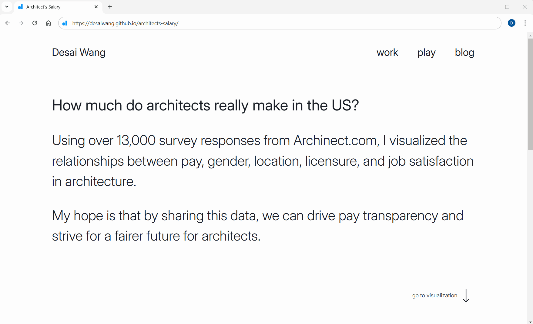
Architects Salary
Overview
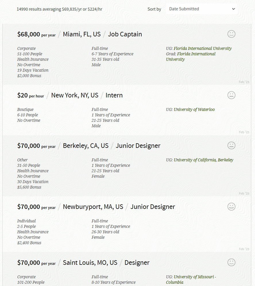
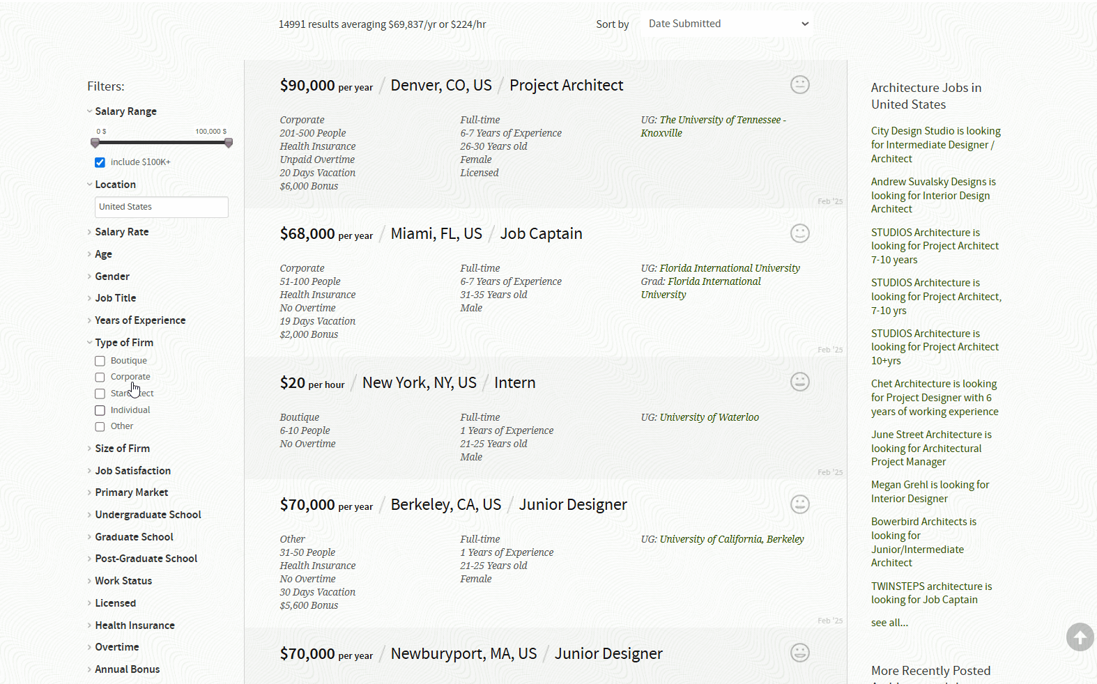
I was searching for a database of compensations in architecture when I stumbled across the long-running salary poll on Archinect.com. The survey featured more than 14,000 responses from the US alone, and includes information on income, location, gender, firm type, years of experience, licensure and more. However, results are displayed in paginated table entries which makes it difficult to see lots of data points at once and synthesize information. Feel free to explore the live site or read more in my technical blog post.
Duration
Aug-Nov 2024
My Role
- Frontend Development
- Visual Design
- UI/UX Design
- Usability Testing
tools
- JavaScript
- HTML/CSS
- D3.js
problem
solution
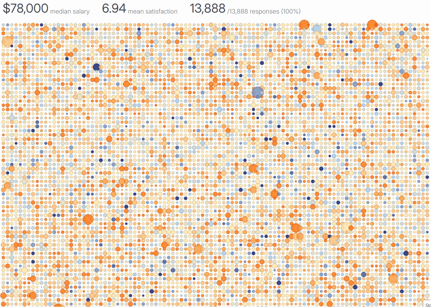
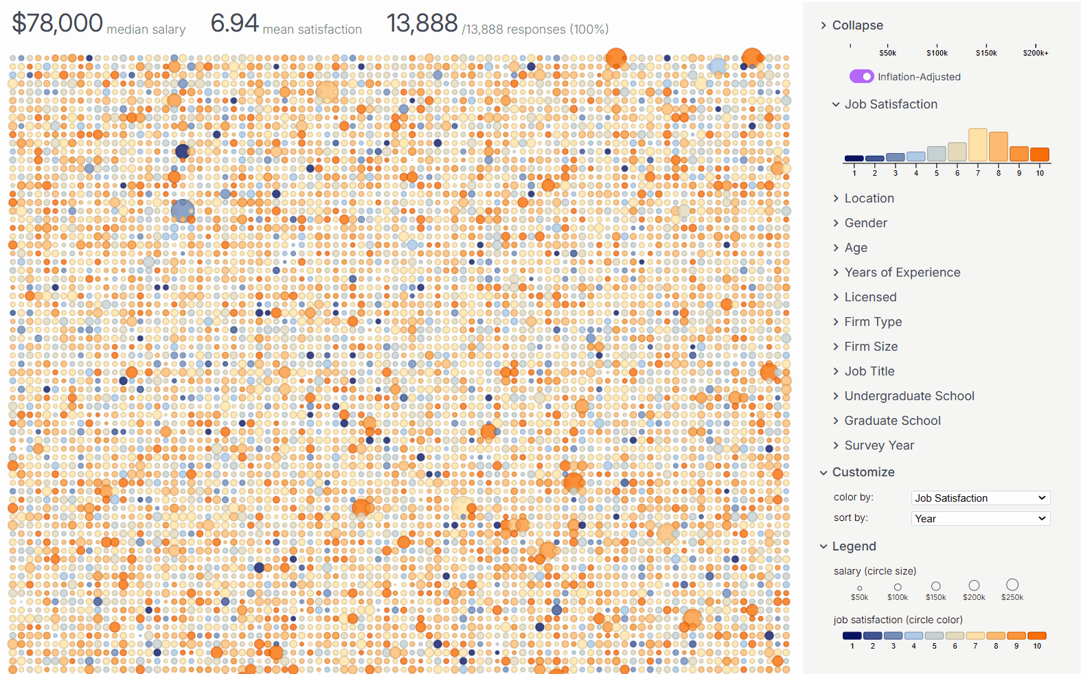
How to show more data while maintaining readability?
Instead of rows within a table, each survey response is now represented as a circle with size mapping to income and color mapping to job satisfaction. Users can quickly scan trends, then hover over circles to access detailed insights on demand. Previously the small heading with median income and number of responses was quite hidden. I emphasized them that the user always had an overview of displayed data.
How can filtering data be more fun?
I wanted the filters for the responses to also reveal data distribution, so I implemented linked histograms and density plots that are dynamically updated. Each filter is tied to a unique color scale, making it easier to visually differentiate categories and sort responses intuitively. This also allows users to quickly identify trends at a glance. Finally, filtered out data are greyed out in place to preserve relationship between part and whole.
Reducing Overwhelming Choices
Performance Improvements
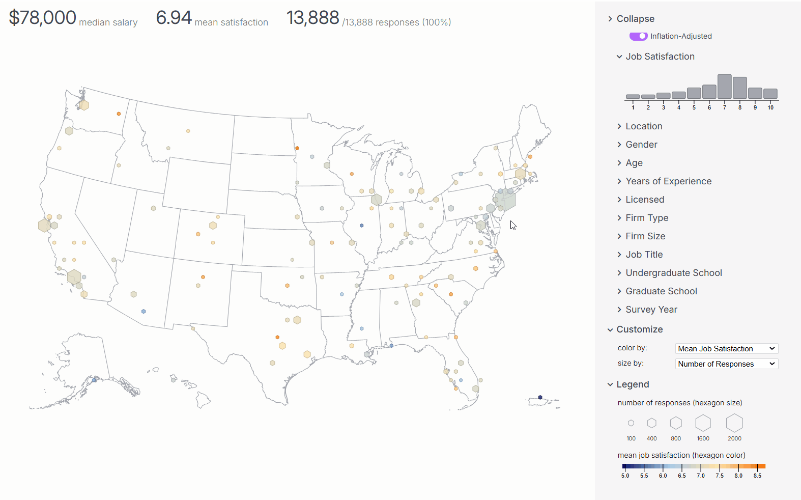
How can information be synthesized?
Further, I implemented a hex bin map to summarize filtered data by geographical areas. This map aggregates data points within hexagons and can display mean job satisfaction, median salary, gender distribution, and most common location name. I omit hexbins with less than 5 responses to ensure that summaries are not skewed by small sample sizes.
User Testing & Improvements
I conducted user testing with 5 architects, and posted my work on Archinect.com for feedback. One improvement I made was turning the histograms into a radio-button like selector, so users can quickly select a single category. Multi-select can be done by holding shift and selecting, or using the cross hair to select multiple at once.
Another feedback I received was adjusting the incomes for inflation. To do so, I calculated the inflation rate using the Consumer Price Index (CPI) at the time of the survey. While I kept the original salary values, users can now toggle inflation-adjusted salaries to compare past earnings in today's dollars.